%20(1).png)
.png)
Fundacja dla Wolności’s website had strong content and a strong mission, but the user journey needed more clarity for first-time visitors. We reorganized the homepage around the main audiences and actions, improved the visual system and readability, and made the site feel more consistent and trustworthy. We also added an ecommerce module to support fundraising through merchandise, keeping the experience lightweight and aligned with the foundation’s identity. The project included launch support and guidance so the team can confidently manage updates going forward.
We started by mapping the foundation’s key audiences and goals: supporters who want to help quickly, partners looking for credibility, and community members searching for programs. We reviewed the existing site structure, identified the biggest points of confusion, and aligned on what “success” looks like: faster understanding, clearer programs, and more completed actions.
We reshaped the information architecture so the mission and programs are easy to scan. We clarified the homepage story, improved page hierarchy, and designed clearer CTAs for donating, contacting, and exploring programs. At the same time, we planned how ecommerce should fit naturally into a nonprofit experience without feeling “too commercial.”
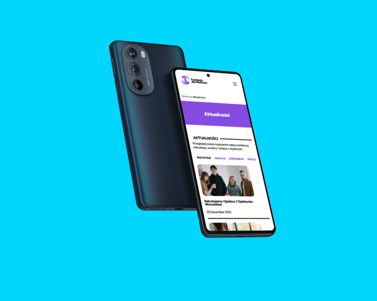
We implemented the rebrand and built a cleaner, mobile-first front end. We improved readability, spacing, and content blocks to reduce cognitive load. We added ecommerce functionality for merchandise and ensured the shop flow stays simple and consistent with the website’s trust-first design.
Throughout the project we kept feedback loops tight, adjusted quickly to real needs, and supported the team during launch. After rollout, we provided guidance so the foundation can manage content, products, and updates without friction.
.webp)

.webp)

